THE VIEW FROM WITHIN
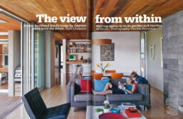
A new Auckland family home by Andrew Meiring opens up to its garden as it reaches away from the street.
Fitting a new home into its built environment is always a challenge, but perhaps never more so than when the closest neighbour is a one-time winner of this magazine’s Home of the Year award, and the area is known for its mix of fine architecture and classic buildings. While it might have been tempting to use an empty site in such a street to display some competitive pyrotechnics, that’s not architect Andrew Meiring’s style. Nevertheless, he did feel more than the usual responsibility to the surrounding environment when designing this family home in Auckland’s Cox’s Bay. “It’s a street that’s got some good pieces on it, but from a context perspective, 1was working with the two houses on either side of the site. That’s got a lot to do w ith how both of those houses engage with the street – they’re quite open, with no gates, and well-landscaped.”
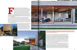
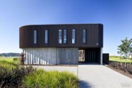
Client Rachel Luisetti and her husband were similarly determined not to isolate the house behind gates and retaining walls, and unusually in this age of rocketing land prices, wanted to g ive a little bit of the property back to the street. The result is a pleasingly park-like street front, with a long bench beside the front door, careful landscaping, and a reflecting pool under the eaves. Yet the windowless facade of this welcoming entrance offers no clues about the house beyond. “I wanted the front and back to be vastly different,” Andrew says, “the ‘opening up of the coconut’ at the back and the ‘shell’ to the front.”
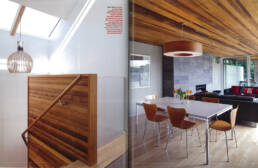
Once this ‘shell’ is cracked, there is a moment of carefully orchestrated ambiguity. The exterior’s slim-profile cedar weatherboards flow from the facade into the house along the entrance hall, wrapping up a stairwell and terminating naturally at the top. The red-cedar ceiling forms one continuous line from the front door to the end of the living spaces. “Following those materials in and how they end is very important because they accentuate the spatial axes and connect spaces,” says Andrew. “Exterior concrete block walls come right into the house, continue through and pop out again, exactly the same finish inside as out.” This serves two functions – to blur the distinctions between outside and in , but also to cater to Rachel’s love of natural materials and dislike of plasterboard. With three children approaching theirteenage years, (Jack, 13, Kate, 11, and Henry, 5) this is very definitely a family home. “I’ve lived in many houses with Gib wails,” says Rachel, “and with children in the house it gets so knocked around.” Andrew responded w ith a palette of concrete block
walls finished in a pigmented concrete plaster, concrete and New Zealand tawa floors, and Western red cedar linings. “There’s a real richness in those materials so you don’t need to put a whole lot of other colours into the house, as you can easily overcook it. Clients often shy away from having different timbers in the same space, but it’s much more possible and effective than people think.”
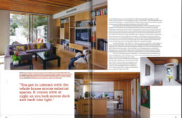
The lower level of the house gradually “undresses itself”, opening off the entrance hall into bathroom and soundproofed “man cave”, and emerging into a large living/dining area walled in glass. Adjacent to the kitchen, a smaller family room opens out onto a wraparound deck with a pool. However, even though the house itself terminates, it seems to flow back to the site boundaries. This is an impressionAndrew has deliberately created by making sure that rather than looking out simply onto lawn or planting, the house always looks back onto itself. From anywhere in the kitchen and living spaces, the view is of the sweep of the rest of the home. “You’re always able to position yourself within the house when you’re looking outwards,” Andrew says. “That’s the benefit of any courtyard-style design – you get to interact with the whole house across external spaces.
It comes alive at night as you look across dark and back into light.”.
Conversely, given the openness and transparency of the downstairs living, the upstairs was conceived very much as private space. Rachel was intent on shaping a home that would cater to her family’s current and future needs, and the positioning of the children’s bedrooms shows a keen understanding of these requirements. Although the three bedrooms are side-by-side along a small hall, the two boys share a bathroom and a balcony while eleven-year-old Kate’s room is at the end of the hall with a private en suite and separate balcony. Sightlines have been carefully planned so that while the children’s rooms have full-height glazing, only the tip of a roof and established planting can be seen out the windows, ensuring total privacy. The master bedroom is similarly screened, although much more exposed to the view towards Cox’s Bay. Another challenge was what to do with the owners’ art collection. “The clients’ art is very important to them,”says Andrew,”and Idefinitely took that into account when designing.We planned where the main pieces would go, but with the requirement for so much glazing and allowing for views and light,we were restricted as to wall space. Hanging art on concrete block walls is al so challenging,but Rachel decided to install permanent hanging solutions, rather than a gallery-style rail with descending cables.”
Above all, this home speaks of flexibility. A wood-fired barbecue doubles as an outdoor fireplace for winter evenings. The “man cave”,with its drop-down screen and projector, doubles as the guest room. Glass sliding doors ca n close off all the living spaces for privacy while still allowing the clients to monitor their children.And with its casual elegance and rich palette of natural materials, this home can stand proudly alongside its famous neighbour.
Text Christine McBride
Photography Patrick Reynolds
Related Posts
BEACHCOMBER – House built to weather the storms
BEACHCOMBER - House built to weather the stormsIn Bathroom,…


